Making helpseeking easy when it's most needed
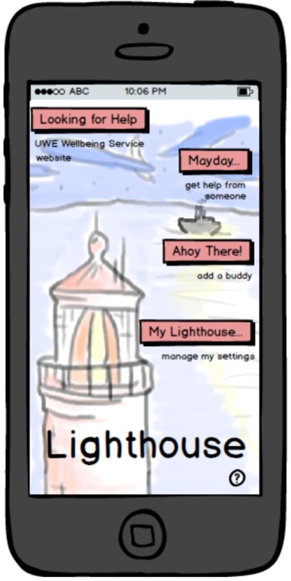
Lighthouse
Lighthouse is a Balsamiq clickable app prototype which was designed with members of the Wellbeing Service at UWE and prospective undergraduate users that aimed to make help-seeking behaviour easier to engage with. Working from interviews with prospective users, both staff and undergraduate students, I developed personas, storyboarded the user experience, then designed the interface to the specification we had produced. The app allows students to develop a trusted help-seeking mechanism with another student or a member of the Wellbeing team and provide an avenue to reach out which removes barriers they would otherwise face, of embarrassment, concern for time-wasting and lack of contacts.
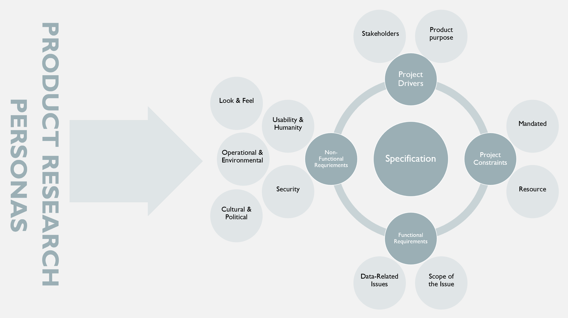
The initial concept for this app came from a series of interviews which I carried out with staff and users of the UWE Wellbeing Service to explore how technology could enhance the functioning of the department. One group of people consistently under-used the Wellbeing Service compared with others: Male undergraduate students. The question to answer then was how can this be addressed. In meeting with the staff, there was a good understanding of what they felt the user flow in the department should be, and thus it was possible to pitch this to non-users and establish where those people would be put off from the process. These interviews identified personas with which requirements engineering could begin. The structure these fell into are briefly summarised below:
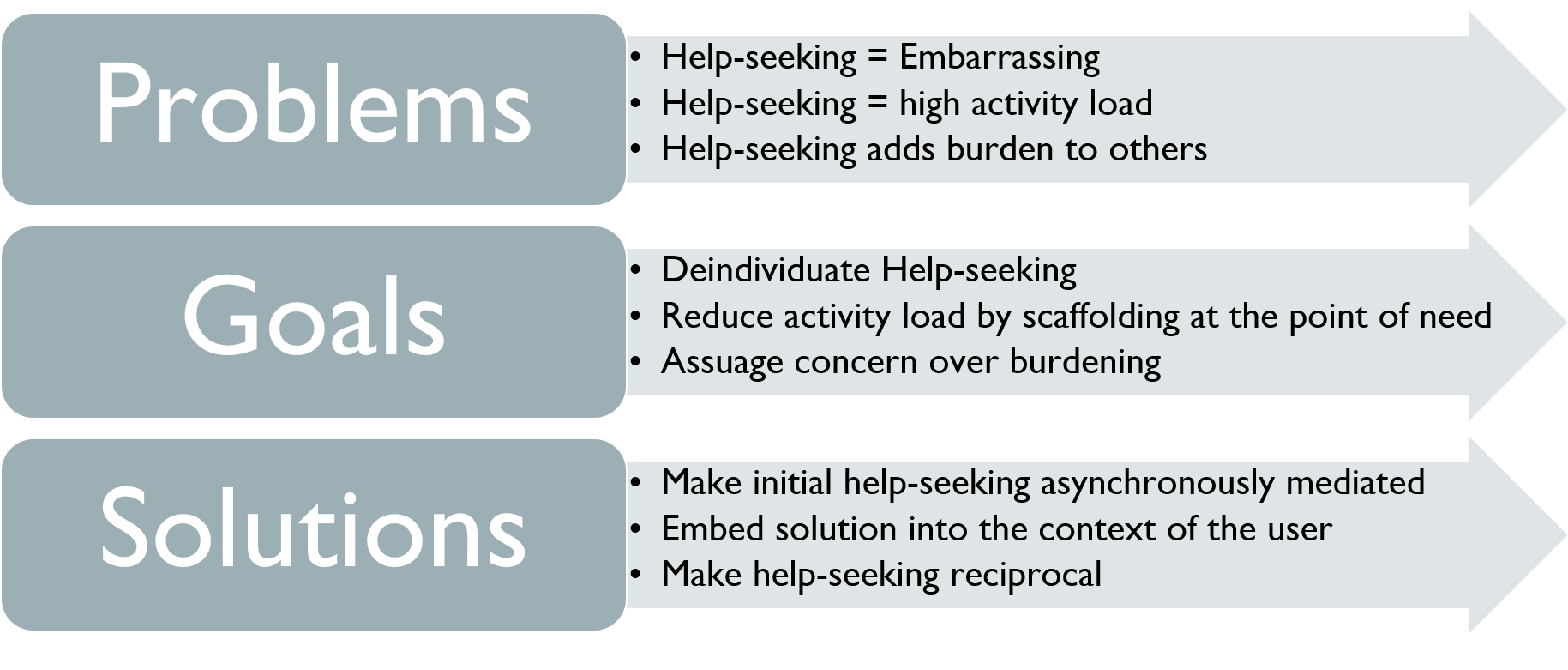
Following requirements engineering, there was the opportunity to engage in ideation. For the purposes of brevity, these were the headlines:
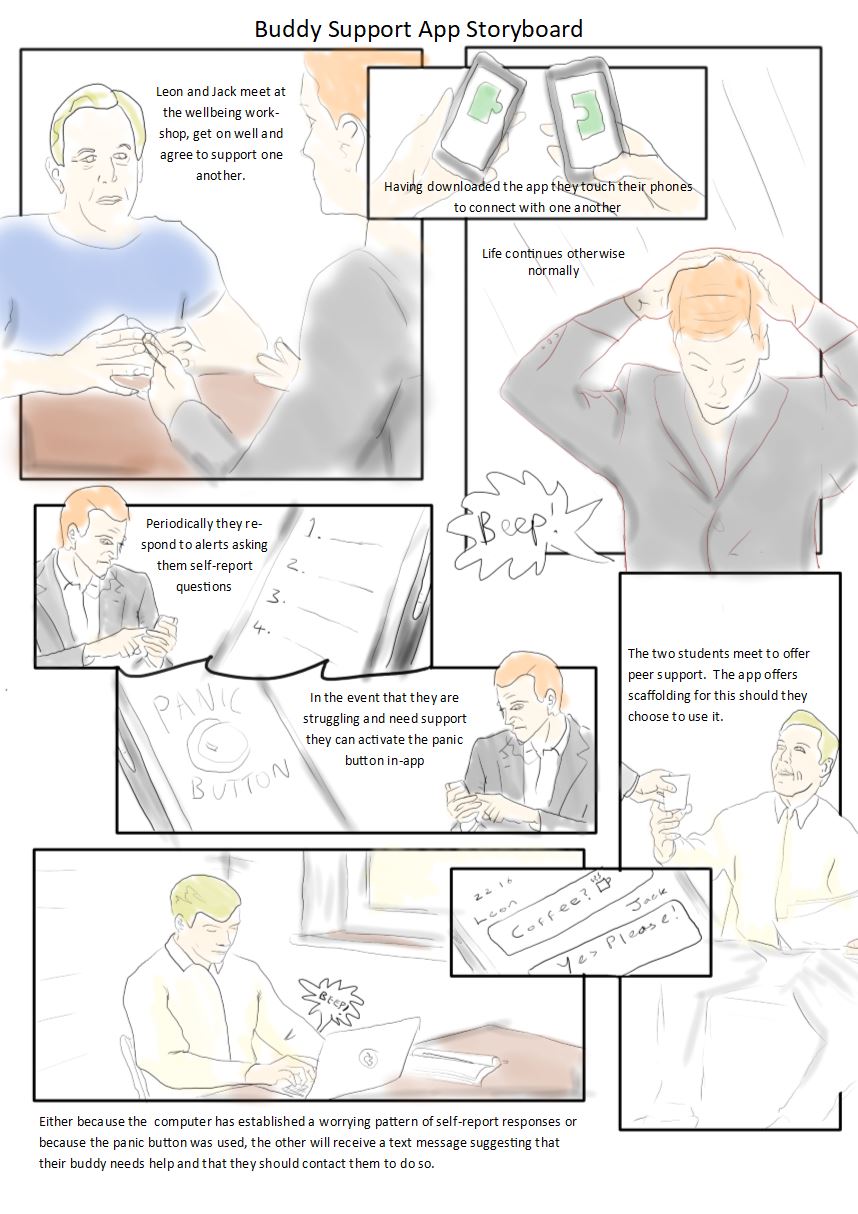
The designed product was beginning to take shape. The user flow was storyboarded:
From this a wire frame was made. This was taken back to prospective users for review and feedback, and this was where I learned a valuable lesson… ...sometimes things don’t work. Just because you think you have all your ‘ducks in a row’, doesn’t mean that the product is going to ‘click’ with users. There is a reason that participatory design is iterative, and during these iterations I had feedback about users being unclear on what the ‘big picture’ was. As such they felt less inclined to engage with it. I am a user-focused designer. I can’t ignore this sort of feedback because I am invested in the product. So, I went back and forth with different approaches, but ultimately the one which brought the product together and improved the prospective user feedback was the ‘Lighthouse’ metaphor. Hanging this over the product allowed each of the functions to be tied together. Lighthouse was born.
All projects teach us, and I learned plenty on this particular one. Firstly that no amount of frustration should push me away from actively listening to my users. Secondly, it taught me that there were a range of stakeholders which needed to be won over by my project, and not just prospective users: in this case, staff running the department. Following my handover of the materials, they reacted with initial interest but development of the tool went by the wayside following a sudden restructuring of the department. This was a big disappointment, but was formative in helping me to understand how to operate my Ux research and design activity in a commercially-aware manner and I am grateful that this insight has served me well in projects I have undertaken more recently. Looking back with the benefit of hindsight, there are further issues I would have with the design I shipped, but I’m like that - The best thing I’ve built is the next thing I’ll build.
If you would like to discuss this further or have something else in mind, please get in contact, your project could be the best thing I’ve ever built!